
Best Colors to Wear for a Headshot in NYC (2026 Guide)
# Best Colors to Wear for a Headshot in NYC (2026 Guide)
Almost every client who books a session asks the same question before they ask anything else: *what color should I wear?* It is the right question. Of all the choices you make before a headshot — studio or outdoor, suit or sweater, glasses on or off — color is the one that does the most work in the final frame and costs you the least effort to get right. The wrong color fights your face for attention. The right one disappears and lets your expression carry the photo.
I shoot headshots and portraits out of a studio in Riverdale, The Bronx, and I have photographed more than 800 professionals across NYC — attorneys, founders, finance teams, consultants, actors, and people who just needed a LinkedIn photo that did not look like a hostage situation. This is the color guide I wish every client read before they packed their bag. No theory you cannot use. Just what reads well on camera, what to avoid, and how to choose based on your skin tone, your background, and what the photo is for.
*Ready to update your professional image? [Book Your Session](/book) — same-week appointments are usually available.*
Why Color Matters More Than You Think
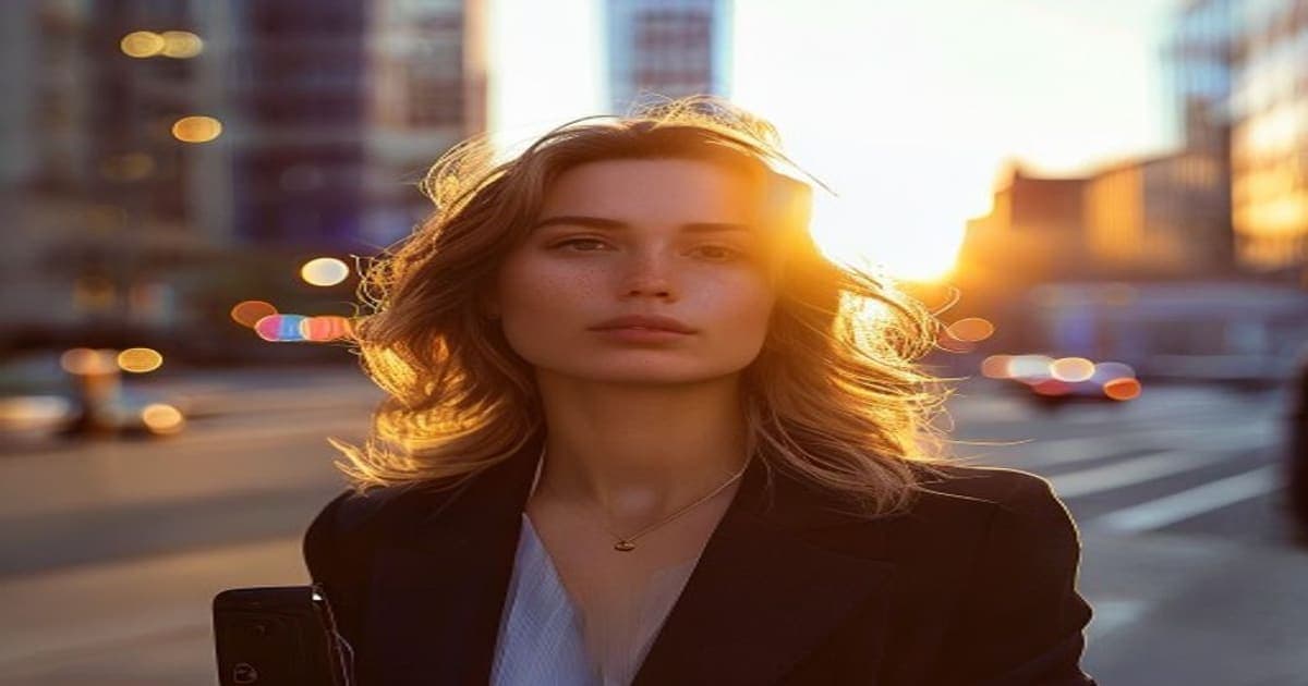
A headshot is a tight crop. In most cases the frame runs from the top of your head to the middle of your chest, which means whatever you wear fills nearly half the image. That fabric is not a background detail. It is a giant color card sitting directly under your face, and the camera reads it as a light source. A bright red blazer bounces red onto your jaw. A lime-green top casts a faint sick tint under the chin. A crisp white shirt under soft light brightens your whole face and makes your eyes pop.
This is why "wear what makes you feel confident" — well-meaning advice you will read everywhere — is only half true. Confidence matters, but the camera does not care how you feel. It records what reflects. The goal is to choose a color that does three things at once: flatters your skin tone, separates cleanly from the background, and matches the message you want to send. Get those three right and you look like the most rested, capable version of yourself. Get them wrong and even perfect lighting cannot fully save the shot.
The Safe, Strong Core: Navy, Charcoal, and Deep Tones
If you want one rule to carry you through, it is this: **deep, saturated, low-contrast-to-your-skin colors almost always win.** Navy is the single most reliable color I photograph. It reads as serious without reading as severe, it works on every skin tone I have shot, and it photographs the same under studio strobes and Bronx window light. Charcoal gray is its close cousin — slightly softer, a touch more approachable, still unmistakably professional.
Other deep tones in this family that consistently photograph well:
- **Forest and bottle green** — rich, a little distinctive, flattering against warm and cool skin alike. - **Burgundy and oxblood** — adds warmth and personality without shouting; excellent for people who find navy too expected. - **Deep teal and slate blue** — modern, photographs beautifully against a mid-gray background. - **Plum and aubergine** — underused, surprisingly universal, reads creative-but-grounded.
These colors share a quality: they are saturated enough to hold their own next to your face but dark enough that they do not compete with it. They also hide wrinkles, lint, and the small fabric distractions that bright or pale colors broadcast. For an executive portrait or a finance headshot where the brief is "trustworthy and senior," this family is the entire menu. There is a reason it is the uniform of the [executive portraits](/executive-portraits) I shoot for partners and managing directors.
White, Light Blue, and the Classic Shirt
A clean white or light-blue dress shirt is a classic for a reason, but it comes with a condition. White is a brightener — under good light it lifts your face and reads crisp and honest. Under bad light, or against a white or very light background, it blows out, loses its edges, and turns your torso into a featureless bright blob. The fix is contrast: white works best against a mid-tone or dark background, which is exactly how I shoot it in the studio. If you love a white shirt, bring it, and let the photographer set a background that gives it an edge.
Light blue is the gentler, more forgiving version of white. It carries the same fresh, approachable quality without the blow-out risk, and it is my default recommendation for anyone shooting their first [corporate headshots](/corporate-headshots) who wants to look polished but not stiff. Pale pink and soft lavender also belong in this approachable-pastel lane — just keep them muted, not candy-bright.
Colors to Approach With Caution (or Skip)
Some colors are not banned, but they ask for trouble. Here is the honest list.
1. **Pure bright red.** It is the most aggressive color in the frame and it bounces a warm cast onto your skin. It can work for a bold personal brand, but it pulls every eye away from your face. Use sparingly and only on purpose. 2. **Neon and high-saturation brights** (lime, hot pink, electric orange). They cast colored light upward onto your jaw and chin and almost always make skin look off. Skip them. 3. **Pure black, in some cases.** Black is elegant and slimming, but against a dark background it merges into a shapeless mass with no shoulder definition. It works against a lighter background or with good rim lighting — talk to your photographer first. 4. **Pure stark white tees** without structure. They read as casual and tend to blow out. A structured white shirt is fine; a thin white tee usually is not. 5. **Anything you keep tugging at.** If a color only works when you are fidgeting with the collar, it will not survive a 45-minute session. Comfort is part of color.
Patterns, Logos, and Texture
Color is not only hue — it is also what is printed on the fabric. Tight patterns are the enemy of a clean headshot. Narrow stripes, small checks, and herringbone can create a moiré shimmer on camera, a distracting wavy interference that no amount of retouching removes cleanly. If you want pattern, go large and low-contrast: a wide, soft windowpane reads as texture, not noise.
Texture itself is your friend. A flat block of color can look lifeless; a fabric with subtle weave — a knit, a soft tweed, a matte wool — catches light and adds depth without adding distraction. And logos: keep them off, or keep them tiny. A visible brand mark dates the photo and pulls focus. The fabric should support your face, never announce itself.
Matching Color to Your Skin Tone
The same navy does not land identically on every person, and the best color for you depends partly on your undertone. A simple test: look at the veins on your inner wrist in natural light. Bluish-purple suggests a cool undertone; greenish suggests warm; if you genuinely cannot tell, you are likely neutral and have the widest range.
- **Cool undertones** (pink, red, or bluish cast to the skin) shine in jewel tones — sapphire, emerald, deep purple, true blue — and in crisp white and gray. Avoid muddy oranges and yellow-greens. - **Warm undertones** (golden, peachy, or olive cast) come alive in earthy and warm colors — olive, rust, camel, cream, warm burgundy, forest green. Icy pastels can look slightly washed against warm skin. - **Neutral and deeper skin tones** carry almost everything, and they look especially striking in saturated, high-energy colors — rich teal, royal blue, true red used carefully, bright white against a dark background.
If this feels like a lot, do not overthink it. Navy and charcoal are nearly undertone-proof, which is exactly why they are the safe core. Use the undertone notes to add a *second* outfit with more personality, not to agonize over the first.
Color and Your Background
Color is a relationship, not a fixed property. The single most important pairing in the whole frame is your clothing against the background behind you, because that contrast is what gives your shoulders an edge and keeps you from melting into the backdrop.
In a controlled studio I can build that contrast deliberately: a dark top against a lighter gray, a light shirt against a deeper background, a rim light to carve your shoulder away from whatever is behind it. Outdoors — say a [LinkedIn headshot](/linkedin-headshots) shot in the greens of Van Cortlandt Park — the background is greener, softer, and full of natural color, so warmer wardrobe tones and mid-darks tend to sit more naturally than stark white. The practical takeaway: tell your photographer where you are shooting and bring options. A color that is perfect against gray seamless can be the wrong call against summer foliage, and a good photographer will steer you in the moment.
A Simple Packing Strategy
You do not need a capsule wardrobe. For a standard session, bring two to three tops you feel good in, anchored by one reliable deep tone (navy or charcoal) and one lighter option (light blue or a soft white shirt). Add a third with a bit of personality if your brand allows it — a burgundy, a forest green, a textured knit. That range lets us shoot a conservative frame and a warmer, more human frame in the same sitting, and you walk away with options for different audiences.
Everything I shoot is delivered within 48 hours, and the studio holds a 5.0 Google rating largely because clients leave feeling like the photo actually looks like them on a good day — which starts with color that works *with* their face instead of against it. (If your last session went well, a quick note on our [reviews page](/leave-a-review) genuinely helps other NYC professionals find the studio.)
Frequently Asked Questions
**What is the single safest color to wear for a professional headshot?** Navy. It flatters every skin tone I have photographed, reads as serious without being severe, and photographs consistently under both studio and natural light. If you bring one thing, bring something navy.
**Can I wear white to a headshot?** Yes, but pair it with a mid-tone or dark background so it does not blow out and lose its edges. A structured white dress shirt against a gray or dark backdrop looks crisp and honest. A thin white tee against a white wall usually does not work.
**Should men and women wear different colors?** The color rules are the same — deep saturated tones win, brights and tight patterns cause problems. The garment differs, the color logic does not. Navy, charcoal, burgundy, and forest green flatter everyone.
**Do I need to match my outfit to my company's brand colors?** Only if the photo is specifically for a branded team page and your company asks for it. For LinkedIn, bar directories, and general professional use, choose what flatters you first. You can always add one on-brand option as a second look.
**What colors should I absolutely avoid?** Neon and electric brights (they cast colored light on your skin), tight small patterns (they shimmer on camera), and large visible logos. Pure bright red and pure black both work only in specific lighting and background setups — clear them with your photographer first.
Bring the Color, We'll Handle the Rest
Color is the easiest high-impact decision you will make about your headshot, and now you have the whole map: deep saturated tones as your core, white and light blue for a fresh classic, undertone notes to add personality, and a packing plan that gives you range. Pack two or three tops, lead with navy, skip the neon, and let the session do the rest. Studio in Riverdale, The Bronx, sessions $99–$599, every gallery delivered in 48 hours.
*Looking to update your professional image? [executive portrait photographer NYC](/) — same-week sessions in Riverdale, NYC.*
[Book Your Session](/book) and bring your two best colors. We'll find the one that makes the photo.
Explore NYC Headshot Services
Same-week sessions from $149. Retouched delivery in 48 hours.
Related Reading

Ready to Create Something Beautiful?
Whether it's a portrait session, a brand shoot, or a commercial project — let's bring your vision to life.